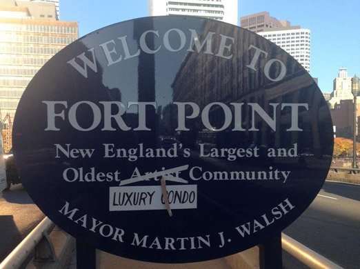
Boston seeks neighborhood artists to replace all those blue oval welcome signs

Fort Point's infamous welcome/good-bye blue oval.
The mayor's office today announced a design contest to develop unique welcome signs for each of the city's unique neighborhoods - to replace the uniform blue ovals that have announced neighborhoods since the Menino administration.
"Whether someone is a longtime resident of a neighborhood or a visitor seeing a neighborhood for the first time, they'll be greeted by vibrant, inspiring artwork that reflects the talent and creativity of our city," Kara Elliott-Ortega, the city's chief of arts and culture, said in a statement.
Artists, who have to live or work in Boston, although preference will be given to artists who live in the neighborhood they're proposing a sign for. Winners will receive a $1,000 stipend.
There are some restrictions: Palettes have to comply with ADA color-contrast requirements, can't look like traffic signs and can't include any "offensive" imagery. And they have to comply with the city's "curatorial vision:"
The Curatorial Vision for the City of Boston is to foster the creation and collection of artworks that reflect the people, ideas, histories, and futures of Boston, the traditional homeland of the Massachusett people and the home of the neighboring Wampanoag and Nipmuc peoples.
Would be sign designers have until 5 p.m. on March 3 to submit their proposals.
The funding will come from the city's federal Covid-19 relief funds.
Ad:

Comments
Haha
JP's is going to be ridiculous.
Interesting note: Charlestown
Interesting note: Charlestown doesn't have any of those blue oval signs.
There is one next to the 99
There is one next to the 99 by the way of lights
Be careful what you wish for.
Be careful what you wish for. What would Newmarket Square's Industry District sign look like?
Magoo sez
Magoo is so going to submit a proposed sign for Magoo-ville, a small not well known enclave between the boroughs of Boston. Magoo-ville exists within the space between spaces, the shadow’s shadow, the opposite end of a gravitational vortex. Magoo-ville is everywhere and nowhere. Magoo-ville is the last room in the Dark Tower. Magoo-ville simply, is. Magoo.
With technology it will be
With technology it will be great to lightin up these signs for nighttime ,
“The City and the City”
Gotta read that again.
Thanks, Maggy!
Never thought I’d say that.
Odd...
...I don't see anywhere on the design templates for the mayor's name.
And it's about time!
It has always struck me as stupid and wasteful to update the signs every time there is a leadership change at City Hall.
The only change from Marty
to Michelle is now we actually have a leader, as opposed to a follower.
MassCass? Homelessness, drug
MassCass? Homelessness, drug use, drug trafficking, murders and violence ? I don't see any improvement . If there is an improvement maybe I'm not awake from the nightmare.
Oh no, our little personality
Oh no, our little personality cult is over?
Edit: Thanks dear leader, it's not. It's right there on the right center of every single template.
Am I seeing things?
It’s on there, right center but small.
Brilliant design idea:
Replace the mayor's name with initials. If we'd done that ten years ago, we wouldn't be in this pickle today.
Downside is, all future candidates for mayor have to have the initials "M.W." before the day of the election.
How about just….
…. “a mayor and all the little people too”
Thumbs down
Politely, this is a bad idea. The point of having uniform signs is that you know that the designation on the sign is an official designation and not something someone made up. (We could all design our own street signs too, but the little green signs with the city seal tell you that that is the official name of the street.)
The signs all have to conform
The signs all have to conform to a uniform template, which is linked in the official announcement.
These still include the city seal
and it's not like anyone is going to be horribly misled if someone makes up a new neighborhood sign and puts it up.
But they are all uniform
Take a look at the template. They're all the same size and shape, and have the same wording (other than the neighborhood name) and typography. The difference is the background art.
Didn't see the template was available
I am still not a fan of this idea but I agree that the template helps.
How ironic
It's pretty ironic that there's isn't a Roslindale template in their folder.
Somebody saw your comment!
The Roslindale template is there now, uploaded at 4:33PM today. All the others were uploaded on January 17.
No Charlestown Either
n/t
Save money
just remove Menino and Walsh’s names.
Michelle I’m disappointed
You could have shown us you were different by ending the bullshit of putting the mayor’s name on everything. But I guess taxpayer funded brand promotion is a hard thing to give up.
Can we get rid of the stupid "Village" too?
It's Adam's Corner and Roslindale Sq. and whatever else you used to know your intersections by.
They were never villages. The neighborhoods are but they dont need marketing BS to let people know.
It never fails to amaze,
It never fails to amaze, wasteful spending thy name is Boston.
Boston looks like the old Soviet Union
with the signs, stairs and buildings plastered with the names of all the politicians.