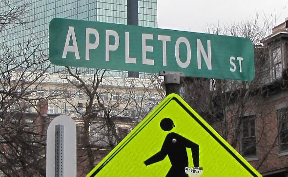
Well, that's a relief: Harmony restored to corner of Appleton and Dartmouth.
City officials today marked the case of the font-challenged Appleton Street sign "closed" after DPW workers replaced the sign that was driving one South End resident insane enough to keep filing complaints with the city over the way the initial letter was so much bigger than the rest and how the letters were all crooked.
But is this the last we've heard of the font kvetcher? The new sign is much larger than the Appleton Street sign on the other side of Dartmouth. Cause for concern?
Like the job UHub is doing? Consider a contribution. Thanks!
Ad:
Comments
Damn, no comic sans.
By Craiggles
Wed, 02/15/2012 - 2:07pm
I want the old sign...that's all I know.
Seriously...
By Roses48
Wed, 02/15/2012 - 2:16pm
why? I know I'm a little late to this but why the hell was that sign such a big deal. Aren't there other things that needed to be replaced more?
I think this was a perfectly
By Whit
Wed, 02/15/2012 - 2:22pm
I think this was a perfectly legit gripe. Glad they bothered with it and got whoever to fix it.
Now if only they'd fix the
By garz
Wed, 02/15/2012 - 2:30pm
Now if only they'd fix the same thing on the corner of Boylston and Clarendon.
Congress St. Too
By SwirlyGrrl
Wed, 02/15/2012 - 4:01pm
I noticed one at the Greenway last night.
I agree. I'm glad they fixed
By datadyne007
Wed, 02/15/2012 - 3:33pm
I agree. I'm glad they fixed it. The City really prides itself on its image. The original sign just looked like shoddy craftsmanship -- certainly not the quality Boston seeks in its streets (huge neighborhood fights over trash cans that help the environment) and development.
Not to condone violence,
By anon
Wed, 02/15/2012 - 2:21pm
but I hope they used the old sign to beat the complainant silly.
One percent problems.
By anonnona
Wed, 02/15/2012 - 2:48pm
One percent problems.
I don't know...
By whyaduck
Wed, 02/15/2012 - 2:52pm
those letters look awfully large to me. And the "st" is so very small in comparison to "Appleton".
I think the kvetcher will be filing another complaint. Mark my words!
Would you say the new one is.....
By merlinmurph
Wed, 02/15/2012 - 5:26pm
...visually jarring? ;-)
(**Her wording in the original complaint)
While stuck in an
By anon
Wed, 02/15/2012 - 3:02pm
While stuck in an unbelievable traffic jam on the Charles Circle->Leverett Circle roadway on Sunday, I had plenty of time to attempt to read one of those new street signs. If I didn't already know it was Fruit Street, I wouldn't have been able to identify any of the letters on the sign except the F.
Who decided these new signs were supposed to be more readable?
Holy crap. They actually
By RhoninFire
Wed, 02/15/2012 - 3:04pm
Holy crap. They actually listen. And of the times they listen, they listen to this guy.
One of us should tape a Comic Sans version of the name on top that the new sign.
Two possibilities
By SwirlyGrrl
Wed, 02/15/2012 - 4:02pm
Yarn bomb oversleeve, or vinyl cling.
Dartmouth Place
By anon
Wed, 02/15/2012 - 3:05pm
Funny, I just walked by there and had my eye out for the offending sign. About 100 ft away from the new APPLETON street sign is a sign for Dartmouth Place--with a great big 'D'! oh, the humanity!
I think the other one looked
By Bri9801
Wed, 02/15/2012 - 4:25pm
I think the other one looked better
You know what...
By Kaz
Wed, 02/15/2012 - 4:29pm
You should really submit your concerns to the Citizens Connect app. ;)
I would but I don't think
By Bri9801
Wed, 02/15/2012 - 4:33pm
I would but I don't think they have a blackberry version :(
WHY IS THAT STREET SIGN SHOUTING AT ME?
By MC Slim JB
Wed, 02/15/2012 - 4:33pm
Won't somebody please teach it how to use the Caps Lock key?
What?
By Boston_res
Wed, 02/15/2012 - 7:00pm
No backlight? How will we all see this in the dark?
City-wide replacement project?
By Michael Pahre
Wed, 02/15/2012 - 8:15pm
They've been replacing signs with this larger lettering in Brighton, too. Is this a city-wide replacement program?
Streets names bordering current, proposed City Council Districts
By theszak
Thu, 02/16/2012 - 12:15am
a.
What are the streets' names bordering the current Boston City Council Districts?... the maps don't label the bordering streets!
b.
What are the streets' names bordering the proposed Boston City Council Districts?... the maps don't label the bordering streets.
After all that, the sign STILL violates
By roadman
Thu, 02/16/2012 - 1:39pm
standard practice. Not because of the now verboten all uppercase lettering, but because of the lack of sufficent space between the legend and the edges of the sign.
Thank you!
By anon
Thu, 02/23/2012 - 10:12am
Thanks to our neighbor who got this changed -- well done!