Developer proposes replacing vacant lot with five-story 'affordable' apartment building on Blue Hill Avenue in Mattapan

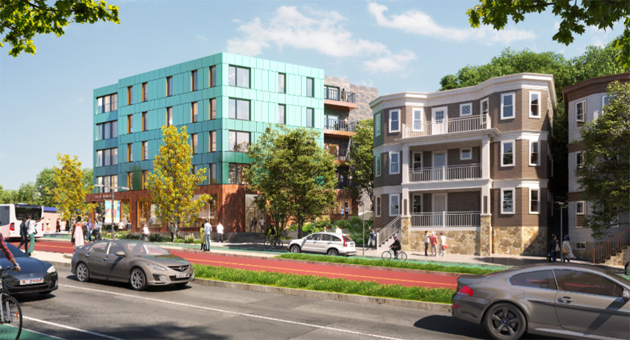
Rendering by Arrowstreet.
A California developer has filed plans to replace a billboard-topped vacant lot at 1471 Blue Hill Ave., at Culbert Street in Mattapan, with a five-story, 48-unit, all affordable apartment building.
In a filing with the BPDA, Lincoln Avenue Capital of Santa Monica, CA says all the studios, 1-, 2- and 3-bedroom units would be rented to people making between 30% and 70% of the Boston area median income - including people with Section 8 vouchers.
The view from across Blue Hill Avenue:

The company adds the building would be designed to generate more energy than it consumes and will be topped with solar panels and not use any natural gas. In addition to the solar panels, the roof will also have a garden deck. Lincoln Avenue adds it has had the building designed to retain a number of existing "old-growth" trees on the roughly 0.6-acre lot.
The proposed building would have 12 parking spaces; Lincoln Avenue says the site is within a quarter mile of several bus lines and a Fairmount Line commuter-rail stop.
The building would also be a few steps from Simco's hot dogs. It's the second residential building proposed this year near the hot-dog stand.
1471 Blue Hill Ave. filings and calendar.
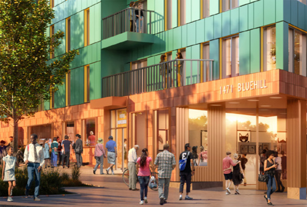
Not a lot of Black people in the renderings of a building in a mostly Black neighborhood:

Ad:

Comments
build baby build
Lemme guess, people are going to show up at the meeting and offer the usual flaccid boilerplate complaints about affordability, parking, and the architecture being out of character with the neighborhood, all the while having zero theories as to how NOT building things can possibly improve the housing situation in Boston.
Don't forget about traffic!
Oh my lord this building is gonna add so much traffic to the area, yadda, yadda, yadda, ....yes please approve this. It makes me so happy the Avenue is finally getting some developments !
Not appropriate for affordable housing
Because it's near the Commuter Rail, which we all know (at least according to Christine Araujo) isn't affordable.
The Commuter Rail is not
The Commuter Rail is not affordable but I am not sure what zone the nearest commuter rail schedule. All Boston needs to be 1A, which cost the same as a subway pass.
It's the Fairmount Line
Which is the same fare as the subway (except for people who board at Readville, but that's not an issue here).
Can you transfer free between the Fairmount Line and the subway
or a bus? This has never been clear to me, and if the answer is yes, I don't know how you do it.
Not in Readville, unless you
Not in Readville, unless you have a Charlie Card that says 1A/2 on the outside. I see a lot of people get off and go to the bus stops around Readville.
Okay
Then all of Winchester, Melrose, Stoneham, etc., too?
Massachusetts Bay Transit Authority. Not Boston. Distance based.
Melrose zone 1 and Medford is
Melrose zone 1 and Medford is zone 1A but Readville, in Boston, is zone 2. Why is a Boston commuter rail stop zone 2? Readville is 1 mile (if that) from Fairmont but the map seems to think it is 5 miles from Fairmont.
She gone
Christine is gone, gone, gone...
Re Simco's, if my calculations are correct...
Someone working full-time at Simco's wouldn't be able to live here because they would only make 15% of the AMI, not the minimum of 30%. And that's if Simco's paid at least the minimum wage, which they've been known to not do.
It's a good idea and has some
It's a good idea and has some great features but lord it's ugly and sticks out from the surrounding buildings really badly. Wish they had gone with some diagonal, larger windows at those corners to maybe give a SLIGHT nod to the buildings next door with the angled tower elements. Especially since it looks like that corner is just two jammed together windows anyway, so it's not like it's really super usable space, except maybe for a plant.
Or I see there's balconies - wonder if they couldn't have rotated the building on the lot to put those center-front. Or used a white trim instead of that bright yellow. IDK, just something architectually to look like they took 10 seconds to glance around the neighborhood.
They should still 100% build it, but it's just kind of a shame to see neighborhoods being filled with this contextless, souless postmodern style that's being build everywhere from dallas to DC. I get triple deckers weren't super fancy architectural buildings when they were built, either, but they've stood the test of time and they NOW lend a very distinct flavor to Boston that's different from the historic housing in other older towns and VERY different from newer cities out west that are filled with nothing but the above.
It needs to be said
It needs to be said that the color is hideous.
It’s a California design that looks ridiculous and offensive here in New England
but good for them for building affordable housing
I like it
At first I thought it was some copper panels that had been weatherbeaten. But its just that color. I think it looks nice. Its better than the white/black/tan/brown color scheme that other buildings that are going up are using.
“Black neighborhood” comment
I’m looking at the renderings and I see a lot of Black people. Why are you feeding into the NIMBYs? why can’t mattapan have nice things?
A lot?
I see a few, but most of the people in the renderings are white - with a few token East Asians thrown in.
On the one hand, so what? Especially with a building that is designed NOT to be part of a gentrifying wave.
On the other hand, why? Why are the renderings of a building in a predominantly Black area showing so few Black people? The developers might have no clue about Mattapan, but their architect is based in Post Office Square.
I agree with Adam
That was one of the first things I noticed too -- are they that unfamiliar with the neighborhood? Did they not involve anyone from the neighborhood? Because that would have been quickly noticed. Makes me wonder if there are other things they overlooked in terms of preferences people in the neighborhood might have.
Also, shouldn't these renderings have suspicious bird groupings flying overhead?
The striking part about the
The striking part about the privately developed project is the affordability commitment -in a good way for once!
I scanned the filling and it says that all units will be rented at 60% AMI or less. Most are 2 br. According to the BPDA chart, rent for a 2br at 60% AMI is $1356 a month. I didn't see any mention of public financing. Truly curious about how they will pull that off given that even on the least expensive land the total development cost of a new 2 br in Boston starts at $400-$500k.
If these guys can make it happen, even with some subsidies, it would help make the case for asking for much more than the current 13% affordable on new projects of 10 units or more.
And yes, the nearly all white crowd on the front page rendering is a serious faux pas when presenting a project in a community like Mattapan. It makes the whole development team -including BPDA who oversees the filling- look totally out of touch. It's like giving the project opponents a big stick to beat you with at the upcoming meeting.
Looks good, build it!
This is not the generic box people will claim, but actually has some interesting faceting, the color is great, something that will stand out with some pop, but not be too radical for modest New England sensibilities. Also love that it shows the center running bus lanes. It's transit oriented development, 100% affordable, green (in color and outlook), this is a big win.