Hey, there! Log in / Register
A tiny little bit of Downtown Crossing history gone
By adamg on Fri, 08/15/2014 - 1:18pm

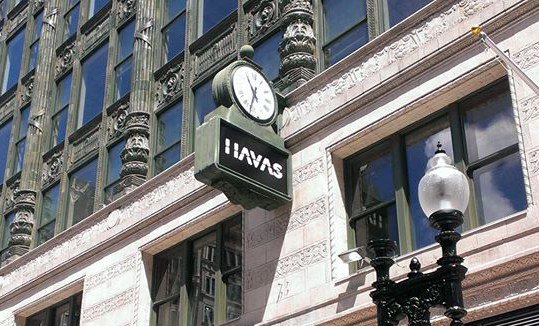
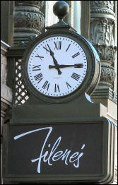
Kris Haight notices they've changed the clocks on the old Filene's building to reflect the name of the Euroadvertising firm that is moving into the new complex.
Maybe they can get the little carillon cherubs to fly Roche Bros. flags, too.
Neighborhoods:
Topics:
Free tagging:
Ad:


Comments
Was it pronounced
Fill-ine's or Fi-line's? Will it be Ha-vas or Hav-as?
It Was Fy-leens...
But since I've never heard of Havas I suspect that it'll be there 3 years and gone.
It's French
so the "h" is silent.
Avast
So is the 's' silent as well?
If not, we can make pirate jokes when they become past tense.
Shameful that you don't know
Shameful that you don't know the former.
Well is it
Dem-e or Dem-i Moore?
Oh, Flying Toaster
Lol.
Yes, it was Fi-leens, how you say "fit" without the T, and leens. Not Fi as in Five and Dime.
Sadly, few of us remain who know it.
Depends
This actually depends on the extent to which you have an accent and, if so, what kind. My extended family who came from New Bedford and spoke with a New England accent pronounced it Fileen's like Fit without the T. However, my mother who did not have an accent (and I for my entire life) pronounce it Fy-leens (like five and dime). Growing up here I have also heard it pronounced both ways, generally depending on the accent that the speaker has to begin with.
I was going to say the same thing.
I definitely heard both--maybe 60/40 towards "Fie-LEENS" but I never heard anyone quibble about it or say that one was more correct.
Alternate pronunciation
I remember once getting a call from my credit card company to confirm charges at Feline's Bass (like the fish). Took me a while to make the connection!
ahhhh, actually
it was Vill-eens (according to my OFD mom and aunties).
What the
Vuck?
Filene's pronunciation demographic
Though the correct pronunciation is "Fie-leens", the "Fah-leens" or "Fill-leens" pronunciation seemed to belong exclusively to older Boston women. My grandmother pronounced it that way and I'm sure many other people's grandmothers did also. I'm not sure why that is the case, but it was the sure sign of being an older female Bostonian.
Helen
look what i gut at the "Basement".
Correct?
Correct?
The correct pronunciation of a family name is the way the family pronounces it. I would imagine that the Filene family is now so diffuse that you could probably find many different pronunciations among its members.
Personal Experience
Seen that happen a lot, where even different brothers [and their offspring] from the same parent pronounce their last name completely different from each other.
Filene's
It's always been pronounced "Fi-leenz" to anyone I know.
Plus its the way they said it in the commercials "only at Fi-leenz"
.
Post-buyout
No, no. They started calling it Filene's when Federated sold it to May.
I'm right about the original pronunciation. And if that makes me an old lady, so be it.
Havas is an advertising firm
Havas is an advertising firm (albeit a euro one) that's moving their offices there.
Thanks
Fixed. Obviously, the euroclothing chain is Primark.
OK, I'll bite
Is it Pri-mark (as in pretty) or Pry-mark?
I thought..
a clothing store was going to move in there... or was it a Japanese clothier?
EDIT: Adam got to me faster. I'm corrected.
Then Why Does The Sign Say IIAVAS?
.
Ask whomever thought
the logo looked 'prettier' with two Is instead of an H.
They wanted a full "H"
Sadly, the logo designer havas'ed it!
Just be glad
It doesn't say HAIVIAS
The clock
at least the clock remains...
but overall the building looks better and better each time I walk by.
what's
your beef with roche bros., bro
huh
I don't have one..
I actually cannot wait for the one in this location to open since it's near work and I'll probably be there a lot. (and now even more if this Market Basket debacle doesn't work itself out)
If the beacon hill lawsuit
If the beacon hill lawsuit people cared about history theyd sue about the removal of this historic sign
I thought the name of the ad
I thought the name of the ad firm was Arnold.
Arnold is owned by HAVAS
Arnold is owned by HAVAS
I would pay up to $5,000 for
I would pay up to $5,000 for that sign if it hasn't been taken already, no joke.
http://www.ispot.tv/ad/7Tx5
http://www.ispot.tv/ad/7Tx5/dominos-pan-pizza-punk-kids
They've been doing everything
They've been doing everything right until this. The modern Euro-chic font doesn't fit with the graceful lines of Beaux-Arts Boston. Still, I suppose its a small price to pay to get this project finally green-lighted.
That's not a V
It's an M.
That Sends A Lot Of Conflicting Messages ...
… they really need to hire an advertising firm to help them clearly express whatever the company name is supposed to be.
Though, the sign looks a lot like a variable message board; it might flip and change to something completely different at any time.
No
I work near by so I looked on my way to the train
It's one piece. They just replaced the plastic. Honestly, I'm surprised the sign isn't Roche Bros or the clothing retailer. It seems like that sign would be better suited for the retailers on the ground level, not an office tenant.
BUT.. they have wooden signs up for the entrances to Roche and the other ground floor retail places so it makes me think they'll have small 'pop out' flat signs to show where the entrances are. (this is possible now because unlike the old Filene's store, a good chunk of the huge awning that ran along summer will not be returning)
That sign wasn't part of the historically protected façade?
If it wasn't, I'm really surprised.
Here in Somerville, any new restaurant moving into the Rosebud diner still needs to be called the Rosebud, because both the painted and neon signs are protected by the local historic district law. This was a problem when Tasty Burger was thinking of moving in a year or two ago.
I wonder
I wonder if it would have been had the sign been a more classic iteration of the logo. That one, I believe is from the 80s. The older logos had a more traditional "F" and thicker lines.
When we were cleaning out my grandmother's closet a few years ago, all of her formal dresses were zipped up in Filene's garment bags from the 60s and 70s, regardless of where and when they were bought. We all had a good smile over that.
That's really sad
They should have left the clock the same. I'm sure there will be plenty of new signage. :( Very much bummed out
Looks like the clock's version of the Filene's logo...
... was not original.
http://departmentstoremuseum.blogspot.com/2011_10_01_archive.html
Maybe someone can find a better/closer shot -- but clearly the flowery-looking script logo (looks 70s-ish to me) was not yet in use at the time of this earlier photo...
So regardless of how it's
So regardless of how it's pronounced, will there be any remnants of the Filene's name anywhere on the building? Many buildings in Boston still possess names of their original companies even though said companies no longer exist.
Prime example 100 Federal still has the Bank of Boston name on it. Though in many cases the names are etched into the building's exterior rather than separate signs.
Boston Five
The Walgreens at Downtown Crossing, formerly Border's, still says "Boston Five" on the ground at the revolving door entrance, as it was originally a Boston Five Cents Savings Bank. I used to have an account there in the days of banks like Boston Five and Suffolk Franklin.
Walgreens actually did a very nice job inside
The back half of the store feels very much like the old-time bank it used to be - right down to the old vault (converted into a meeting room, but with the massive steel door, part of which has been replaced by plexiglass so you can see the inner workings of the lock).