Hey, there! Log in / Register

Roslindale has a font of its very own
By adamg on Sat, 10/16/2021 - 9:57pm
An example of the Roslindale font in action.
David Jonathan Ross designs typefaces. Since 2017, he's been refining one he calls Roslindale, in honor of the uniquely named neighborhood.
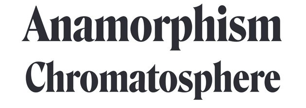
Roslindale is a serif typeface that follows in the footsteps of De Vinne, originally published in the 1890s by the Central Type Foundry and named for the famed nineteenth century printer. It’s an oldstyle that can’t shake its Victorian sensibilities, with sharp, stubby serifs, bulbous terminals, and the occasional hint of diagonal stress.
In text, you’ll find Roslindale to be stylish and sturdy; in display, it begins to flirt with the slickness of 1970s De Vinne interpretations like ITC Bernase.
Ross began looking at using De Vinne as the base for a font of his own at the recommendation of Nick Sherman, another typeface designer with local roots: Sherman once developed a font called Meatland, based on the logo of a butcher shop in Jamaica Plain's Jackson Square.
H/t Melanie DeCarolis in the Jamaica Plain Facebook group.
Neighborhoods:
Topics:
Ad:
Support Universal Hub
Help keep Universal Hub going. If you like what we're up to and want to help out, please consider a (completely non-deductible) contribution.
Comments
Next up
News-tead Fontigrade?
should be typeface
fonts are things like bold, italic, strikethru,...
If you're going to nitpick, let's go all the way.
Font is commonly used as a synonym for typeface. Technically, a font can be considered a combination of a typeface and a weight, size, italics or not, etc. So Roslindale might be a typeface, and "Roslindale Bold Italic Heavy 12pt" would be a font. But in the real world, everyone says font and we all know what it means in context. In modern web pages using CSS, we use the term "font family" instead of typeface.
futura black
i remember when city services used this typeface. i went as far as to download the .ttf onto my android fone as the default text.
helvetica
anyone see the helvetica documentary.